I was scrolling through my photos and was surprised to notice the kind of eerie similarity between the picture of our new orange tent with the blue blow-up Aero bed matched so closely in color and even shape.
So I combined both pictures in Snapped with a bunch of effects layered on:
Pretty cool match, huh? I made the fabric postcard the same day that I took the tent photo, but I didn't choose those those fabrics consciously or anything. They just happened to be on the top of my scrap basket from working on the Metro Twist quilt. Is there such a thing as subconscious color choices? Maybe so.
Here's my Instagram-based 2021 Year Of Color, well actually, it's really Year of Colour with a u. But my spellcheck is set on American lingo of course. This app goes through all of your Instagram photo posts and pulls out the main colors that were represented in your shared images. It's pretty fun to get the results after a year of posting.
And here's the latest photo in my worktable color studies series:
It makes sense that there would be a lot of overlap, as I'm usually sharing photos I've taken in and around my studio. But--still it's fun to see a visual representation of it in front of my face to be re-inspired by.
This second photo seems like it would make a pretty good quilt design. I put it through that new app I was exploring, Percolator and got these two ideas:
Over on Instagram, I've gotten into the habit of making month markers using the app SnapSeed. It's just a way to visually separate the months as you scroll back over your year of posts. This is made from a photo I took on our traditional New Year's Day hike. I made it 4.18 miles, woohoo me!
Every time I remember to use the Year of Colour summing up of one's posts on Instagram for the previous year, I'm struck by what colours stand out (*note the U* I love spelling colour that way*) It always makes sense somehow. And I wonder if I can be conscious about what I post on Instagram to make it look a certain way by the end of the year?? I'm going to try to post more frequently on Instagram this year, so maybe that will work.
I kind of want to print this image out and put it on a t-shirt to wear around for the rest of the year. Wouldn't that be an interesting tee design? Or maybe just cut out different sized circles of these colors and make a quilt?
Sometimes I look at what I've posted on Instagram lately, and I'm struck by color palettes from these sort of random groupings of my photographs.
It reminded me of Palette Builder, which I hadn't played with in a while.
The first color picks were pretty dull compared to the vibrancy of the photos, but it's probably calculating over the percentage of the images that are certain colors, instead of just the bright parts that jump out. A good reminder of color usage in quilts, huh?
Now that's a bit more to my liking, I think these colors together would make a very pretty and lively quilt.
Here's an amazing color picking app, Color Supply, it's intended for use in choosing color schemes for digital illustrations, so it gives the hex values for the main colors. But I thought it was a great all-on-one-screen tool for looking at color choices. You can scroll through complementary, analogous, etc... and change the colors in each setup.
I thought it might be a good resource for quilters. There's a little essay/explainer on the site about why to choose warm vs. cool colors for branding a website/product and it made me think about that in terms of "branding" the quilts we're making. If you're looking to make a happy quilt choose this: X, if you're wanting a somber quilt choose this: X instead, etc. Color tells a story, evokes emotions, etc.
Hey, is there a hex value to kona cottons (or other fabric line's solids) chart somewhere?
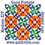
I used this tool to help me pick fabrics to use in the Good Fortune mystery quilt.
Here's one of my favorite pictures I've taken this entire fall. A leaf landed on my windshield and the colors were so striking with the background. It took several tries to get it in focus, but finally I got this shot of it before it blew away.
After looking at it in Palette Builder, no wonder I liked it so much. Look at this glorious fabric color combination. Definitely useable.
Friend Jaye has been playing with a fun online color picker called Palette Builder. You upload a picture and chooses various points to pull colors from and matches it up with solid fabrics that are available.
I gave it a try with this picture:
The initial pick was so drab and 90's looking compared to the dynamic colors of the photo. But then, I hadn't noticed that these kind of boring colors are indeed there in the photo.
Bella Solids Kansas Green 9900-149
Bella Solids Soft Finish Black 9900-199
Bella Solids Prairie Green 9900-102
Bella Solids Rose 9900-62
Bella Solids Brick Red 9900-229
Bella Solids Baby Pink 9900-30
But adjusting where the colors are being chosen from in the photo can really alter the look of the palette. Now this palette I could actually imagine myself using for something.
A color inspiration picture for you to consider today.
These bright clear colors are so vibrant on the store shelf. It's so tempting to choose a mixture of these pieces to bring home, but I stop myself because they won't play well with the other dishes I already own. Do people really buy an entire set in only one of the colors available? Hard to imagine limiting oneself to a single color when there's such a range to choose from.
Just looking at the historical choices over the many years of Fiestaware, it's fun to consider having a kitchen filled with one of each blue ever offered.