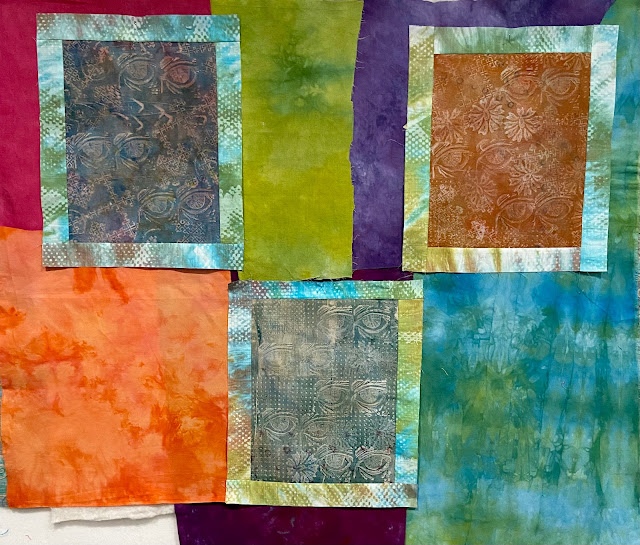
After getting the printing done that I wanted to accomplish I chose my three favorites to put into a quilt to enter into the Print/Quilt exhibit. It was going to have to be on the small side to get done in time, but I really didn't want to cut up the prints. The initial idea was to call this quilt Sightlines and have quilting lines going between all the eyes.
Based on a sketch that took a triad view from my color wheel, I came up with these combination of hand-dyes to sort of frame each one. The cerulean blue print would be framed with chartreuse and blue-red. The Blue Green print would be framed with red-violet and yellow-orange. The orange-yellow print would be framed by aqua green and violet.
I decided that I needed something in-between the print and the much more intense hand-dyes, so I chose a lighter hand-dyed and manipulated one that would tie all three together and had the additional dye printing work of dots which echo the backgrounds of the prints. I thought that looked a lot better, but I still didn't like them all in one piece. Too crowded, too formal, not enough space to have a dynamic design.
What's this? Another triptych?


1 comment:
You could start off the quilt, quilt a straight line to one of the eyes, turn, take a few stitches and then go back to the edge. That would prevent you from having to tie off over and over.
Love the way you work in your sketchbook.
Post a Comment