

So I'm working on a new quilt that is supposed to be for a show with the theme of
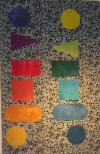
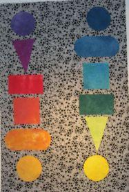
 Harmony, Peace, Renewal. I happened to be reading my color wheel, and there was a phrase that used the word harmony, so I just worked around the color wheel, selecting those opposite each other, and came up with this. I've tried lots of backgrounds and arrangements of the shapes, hard to decide which one is the most harmonious. I think I like this one where the elements aren't lined up. Not sure if I like the hand-dyed background better though.
 What do you think?
4 comments:
Love the shoes, the blinking ice cubes, the landscape pillow, the swamp swap, and the theme of harmony, peace, and renewal.
Try over lapping some of the shapes or moving them closer or make them larger...at this point there is no focal point, and just laying there, they seem to be distant from one another.
Great idea! I like the third one best so far. Maybe if you put them in a loose circle with something in the center? It does seem to need a focal point...
I'm agreeing with karoda. Love the shapes and the colors. I think the background (at least on my monitor) is not doing anything for the composition. I would like to see them on a black and white sort off graphic background, but that would probably take away from the peacefulness!!
I feel tension where the triangles are pointing toward one another. Love the colors of the pieces. Wouldn't mind seeing another background - I like the idea of a pattern or movement. Great beginning!
Post a Comment